Blocks
Add, arrange, and configure the building blocks — fields, layout, and media — that make up a form.
What are blocks?#
A block is one row on the canvas — an input (like Short input or Email), a layout element (like a Divider or Heading), or a media embed (like an Image or Video). Blocks are the pieces you assemble into a form.
Add a block#
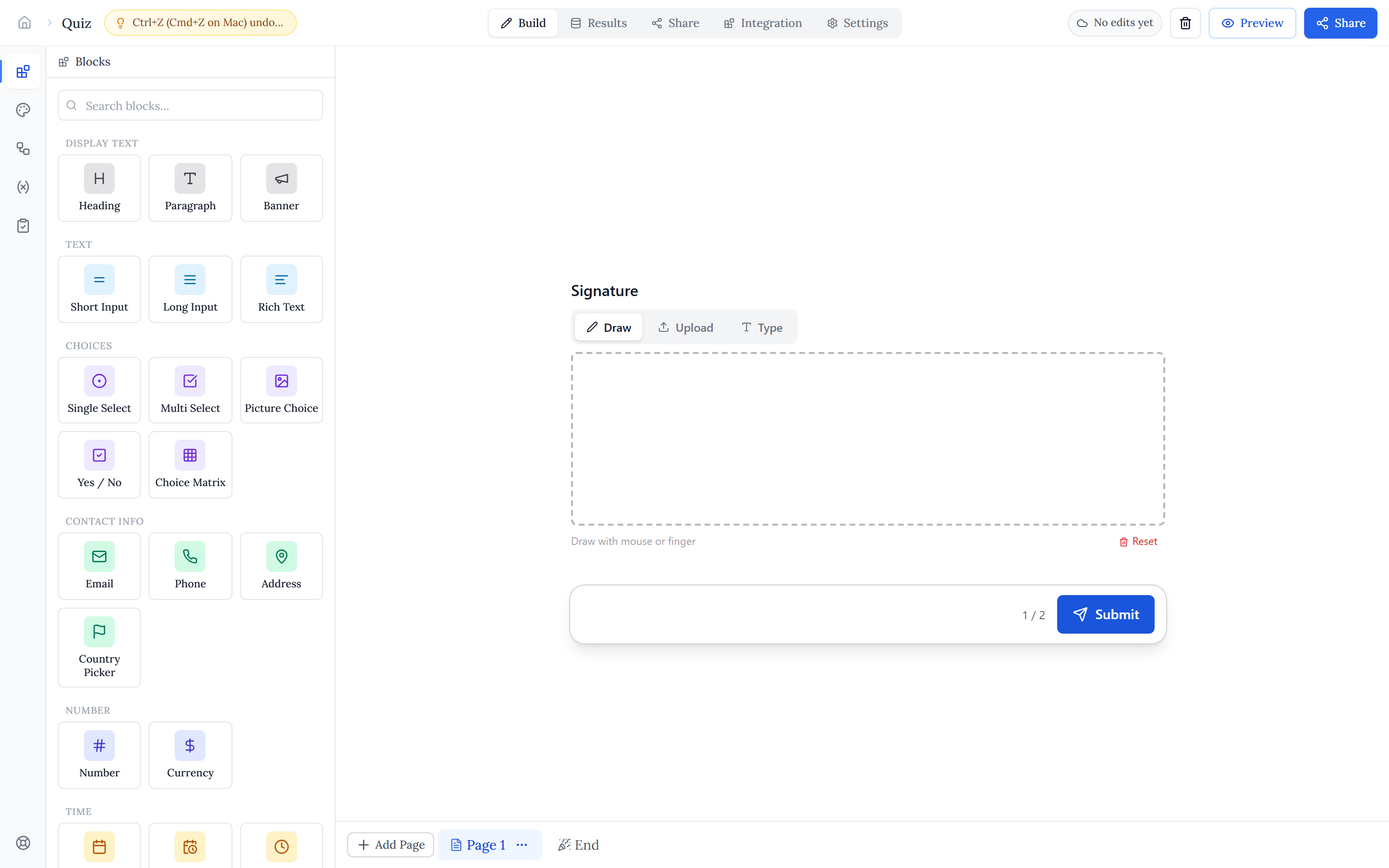
Open the Blocks tab in the left rail. Blocks are grouped into sections (Text, Choices, Contact info, Time, Rating & Ranking, Media, and more), and there is a search box at the top if you know what you want.
- Drag a block from the palette onto the canvas to drop it exactly where you want.
- Or just click a palette tile to append the block to the current page.
Select, reorder, duplicate, delete#
Click a block on the canvas to select it. Selected blocks show inline controls, and you can act on them from there:
- Reorder — drag a block to a new position, or use the up/down arrows.
- Duplicate — copy a block with all its settings.
- Delete — remove a block; deletes are undoable (Ctrl/Cmd+Z).
- Multi-select — select several blocks at once to move them to another page or delete them together.
Side-by-side columns#
Each row holds up to two blocks side by side. Set a block to half width and pair it with another to place them in the same row — handy for First name / Last name or City / Postcode. A full-width block always takes the whole row.
The property panel#
Selecting a block opens its property panel on the right. What is available depends on the block type, but most fields let you set a label, a placeholder, a default value, help text, choice options, and validation. Labels support @-mentions so you can weave in variables, other fields, and dates.
Required fields#
Every input can be made required so respondents must answer before moving on. In the property panel, set Required to Always, Never, or — for dynamic forms — only when a condition matches (for example, required only when Country is Singapore). See Conditional logic for how required-if conditions are built.